The first thing someone feels when they land on a website isn’t the headline — it’s not even the images. It’s the color. It instantly sets the tone: “I trust this” or “This isn’t for me.” At DIGITOIDEAS, we work with this daily. So let’s say it up front — in good design, color isn’t just decoration, it’s a tool.
New trends prove it. Aesthetic matters, but purpose matters more. Color needs to work — to sell, guide, hold attention. And for that to happen, it has to be intentional, not random. In this article, we’ll show you how to choose a color palette that reflects your brand’s personality and makes it more memorable.
How We Choose a Palette (And Why It Matters)
Colors in a project aren’t picked because «the client likes blue.» Every shade affects how a visitor feels on the page. We’ve tested this dozens of times:
- Changed the button color — conversions went up 18%.
- Toned down brightness — scroll depth increased.
Color influences behavior. Use it wisely.
Color Combos That Set the Right Brand Tone

Right now, bold but balanced palettes are taking the lead:
- Muted background + vibrant accent.
Think charcoal and neon green. Minimal clutter, maximum focus. - Soft tones + confident typography.
Perfect for expert-driven brands where clarity matters more than flash. - Contrasts that don’t overwhelm.
Classic black and yellow, blue and orange — they work when used smartly. - Gradients with a hint of texture.
Depth, mood, subtle detail — all in one move. - Earthy tones.
Natural is in again, especially when paired with clean, minimal design.
Color Schemes That Actually Work
If you don’t want to guess what fits — use tested schemes. Designers and agencies use them every day:
- Monochromatic. One color, multiple tones. Clean, calm, never boring.
- Analogous. Hues that sit side by side on the color wheel — naturally harmonious and soft on the eyes. Gentle, balanced — great for relaxed vibes.
- Complementary. High contrast, max punch. Two colors directly across from each other. Instant impact.
- Split-complementary. A bit more flexible. Still contrasty, but smoother on the eye.
- Triadic. Three equally spaced colors. Bold and energetic.
- Rectangle (Tetradic). Four-color harmony. Tougher to pull off, but can look powerful when done right.
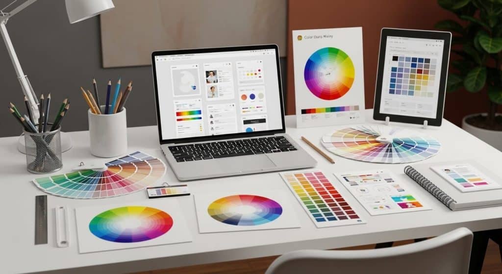
Use Adobe Color to experiment — spin the wheel, test combos, and preview them live.
Choosing the Right Palette – A Step-by-Step Guide

- Start with your logo or brand guide. If there’s already a base, don’t reinvent the wheel — lean on it.
- Study your competitors. If everyone looks the same, it’s a chance to stand out.
- Think about your audience. Gen Z? Corporate clients? Parents? Each group reacts to color differently.
- List the feelings you want to evoke. Trust, energy, calm? Every vibe has its palette.
- Look for references. Browse Behance or Dribbble. Sort by shade and follow what stands out.
Go-To Color Combo to Start With
- Primary color. Sets the overall tone and mood of the site.
- Accent color. For call-to-actions and focus elements.
- Light neutral. Usually white or pale gray — great for backgrounds.
- Dark neutral. Go with deep gray or navy to keep text clean and structured.
This combo works almost every time. From there — feel free to experiment.
What to Definitely Avoid
- Too many accents. If everything stands out — nothing does.
- Colors just for the sake of being “different.” Often looks random and off-brand.
- Choosing based on “I just like it.” That’s not a strategy. Choose based on goals.
In a Nutshell
A good palette isn’t flashy — it just *feels* right. It keeps people on your site instead of making them click away in 3 seconds.
If you don’t want to waste time guessing, and just want it to work — reach out. We know how to pick colors that don’t just look good but actually deliver results.